Our brand is one word: Toro. This single word, within a red shield, is our most widely recognized trademark. Proper use of the logo reinforces the brand and increases its value. The Toro logo is used on all products, digital media, marketing materials and official communications to transact business.
Do not recreate or alter the Toro logo. Any logo you need is available within our download section. If you are unable to find the logo you need, contact Branden Happel or brand.manager@toro.com.
Our logo consists of two parts that must always be used as one element:
- Shield – The red box in which the TORO logotype is placed
- Logotype – Always shown in white, the logotype is centered inside the shield and accompanied by the ® registered mark that rests on the same baseline as the logotype.
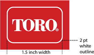
Outlined Logo
When reproducing the logo on a background of the same color as the Toro shield, use a thin white rule to outline the shield. The weight of the outline is 2 points on a logo that is 1.5" in width. The outline weight is scaled appropriately, depending on whether the logo is reproduced smaller or larger.
Logo with Tagline: Horizontal & Stacked
When the Toro logo is used together with the ‘Count on it’ tagline, it is referred to as the Toro signature. The tagline should always be set in the typeface Leviathan with the proper spacing.Preferred placement of the tagline is to the right of the logo, as shown below. For certain situations, where the preferred treatment does not work, such as vertical banners, it is acceptable to use a stacked version with the tagline centered and spaced appropriately beneath the logo. The three approved options are shown.
Preferred Signature
- The preferred (horizontal) version, which has the tagline at half the size of the TORO logotype, is most commonly used on applications.
Stacked Signature
- An alternate (stacked) version can be used in narrow applications, where the two horizontal layouts will not work due to space constraints.
NOTE: The 'Count on it' tagline only appears in English.
Unacceptable Logo Usage
Logo Color Usage
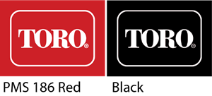
The Toro logo should always be produced in its signature red color (listed below), which follows an approved color format depending on application. For print and apparel, this is Pantone® (PMS) 186 or its 4-color process equivalent (100% magenta, 80% yellow, 5% black).PMS 186
4-color process red: 100% magenta, 80% yellow, 5% black
In limited applications, it is acceptable to produce the Toro logo in black. This includes internal memos, channel communications, and certain apparel and product accessories. For questions, contact Branden Happel or brand.manager@toro.com.
Black
The colors used in this graphic standards manual have not been evaluated by Pantone, Inc. for accuracy and may not match the PANTONE Color Standards. PANTONE® is a registered trademark of Pantone, Inc.
Logo Clear Space
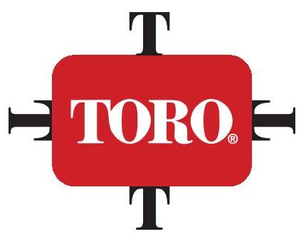
In order to ensure proper visibility and maximize impact, a minimum clear space between the Toro logo and any other elements is required. The clear space surrounds the logo, separating it from photography, text, illustrations and the outside edge of the document. The size of the clear space is measured by the height of the “T” in the TORO logotype, as shown.
Logo Size & Placement
The Toro logo must always measure three units wide by two units high. Never alter the logo’s proportions, the typeface of the TORO logotype inside the shield (along with its position or color), or the position of the ® registered mark.
To ensure legibility, the Toro logo should never be reproduced smaller than 1/4 inch (or 6.35 mm) in height. Some applications, such as screen-printing or embroidery, may require a larger logo to be legible.
- Shirts – the preferred size of the Toro shield is usually 1” high x 1 ½” wide with the shield usually positioned on the left chest, left sleeve or back yoke. Sometimes you may need to consider where the brand logo of the shirt appears (e.g. Nike, Adidas, Cutter & Buck, etc.) or if there is a seam, pocket or zipper that inhibits imprinting in a standard location. On a high-end polo shirt, you may go slightly smaller, but anything smaller than 0.833” high x 1.25” wide will compromise the integrity of the logo.

- Caps – embroidery size of the Toro shield is 1.33” high x 2” wide or 1.18” high x 1.77” wide, depending on the style and profile of the cap. The shield is more commonly placed on the front, but can sometimes appear on the back depending on what is being shown on the front, such as distributor, dealer or customer branding.

- Jackets – the Toro shield is more commonly embroidered on the left chest at a size of 1” high x 1 ½” wide, but can also be positioned on the left sleeve or back yoke.

- Bags – the size of the Toro shield is dependent on the style of the bag, the design, and the location and size of imprint area.
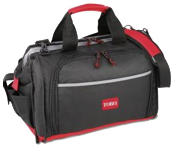
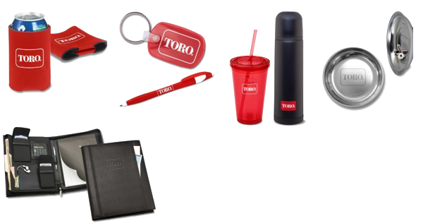
- Other – there is usually a designated imprint location or area pre-determined for such items. 4imprint can help guide you through this, and the brand implications and/or requirements for a particular item.


