
Buttons
Customer engagement and relevance is a primary objective in creating our websites and digital properties. Standardized use of buttons, links and calls-to-action helps to create a simple and consistent user experience.
PRIMARY buttons should be reserved for primary actions available to the user. Examples include Submit, Request Information or Buy Online. You can find these approved buttons and related information at http://www.toro.com/theme/index.html#buttons.
DEFAULT buttons should be reserved for actions available to the user, but are not primary actions a user can take. Examples include Cancel, Start Over or Close.
Color: #CD2027
Text: #FFFFFF
Border: #B30000
ALTERNATE buttons may be used when multiple buttons exist on a page and you want to show an alternate to the primary red button.
Color: #FFFFFF
Text: #333333
Border: #CCCCCC
Color: #333333
Text: #FFFFFF
Border: #333333
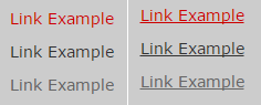
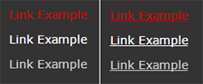
Text Links
Text links must follow the primary digital color palette, as shown below.
Light Theme Examples
Light theme examples assume a white or light grey background.
Dark Theme Examples:
The dark theme examples assume a dark grey (#333333) or base grey (#666666) as the background.
Helper Classes
Helper Classes should be reserved for system messaging that notifies the user of an action that was successful, unsuccessful or to provide other notification. More information can be found at http://www.toro.com/theme/index.html#helper-classes
Color: #e0f0d9

Color: #d9e8f0

Color: #f6efd8

Color: #ebebeb
